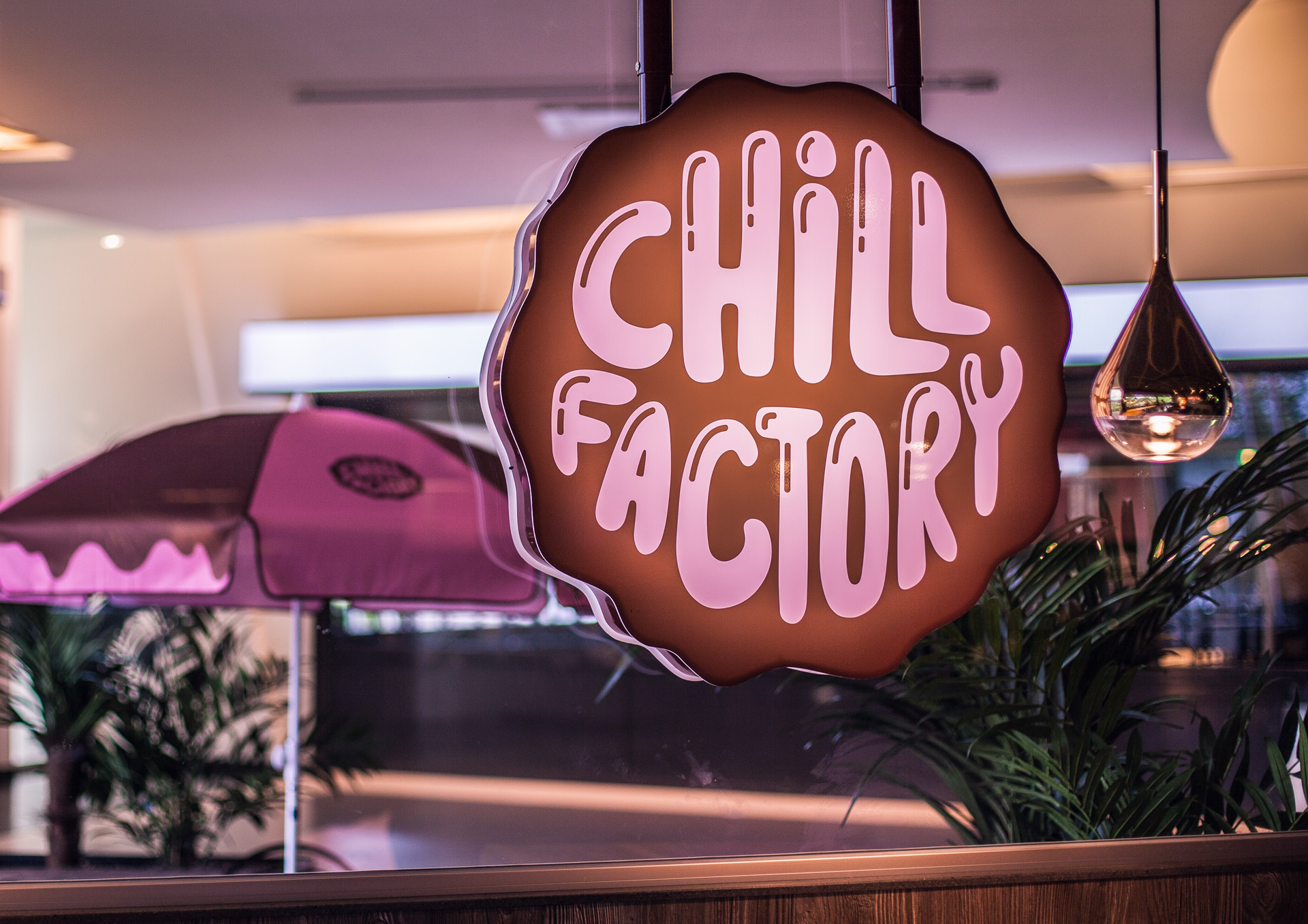
Chill Factory
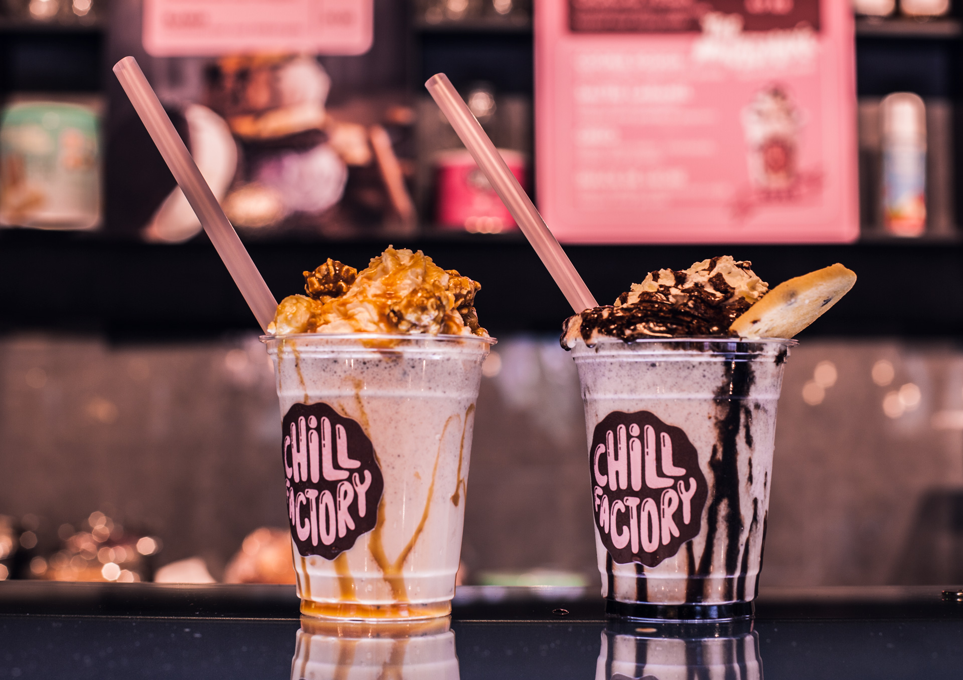
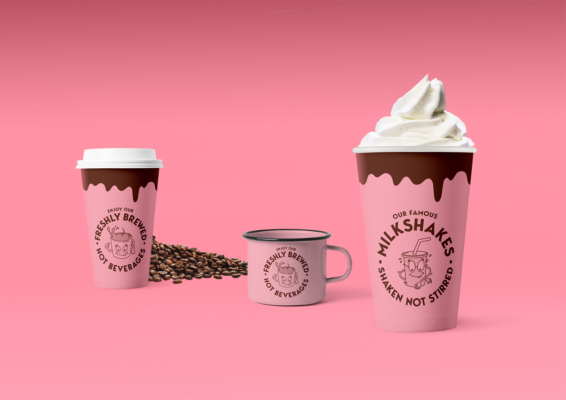
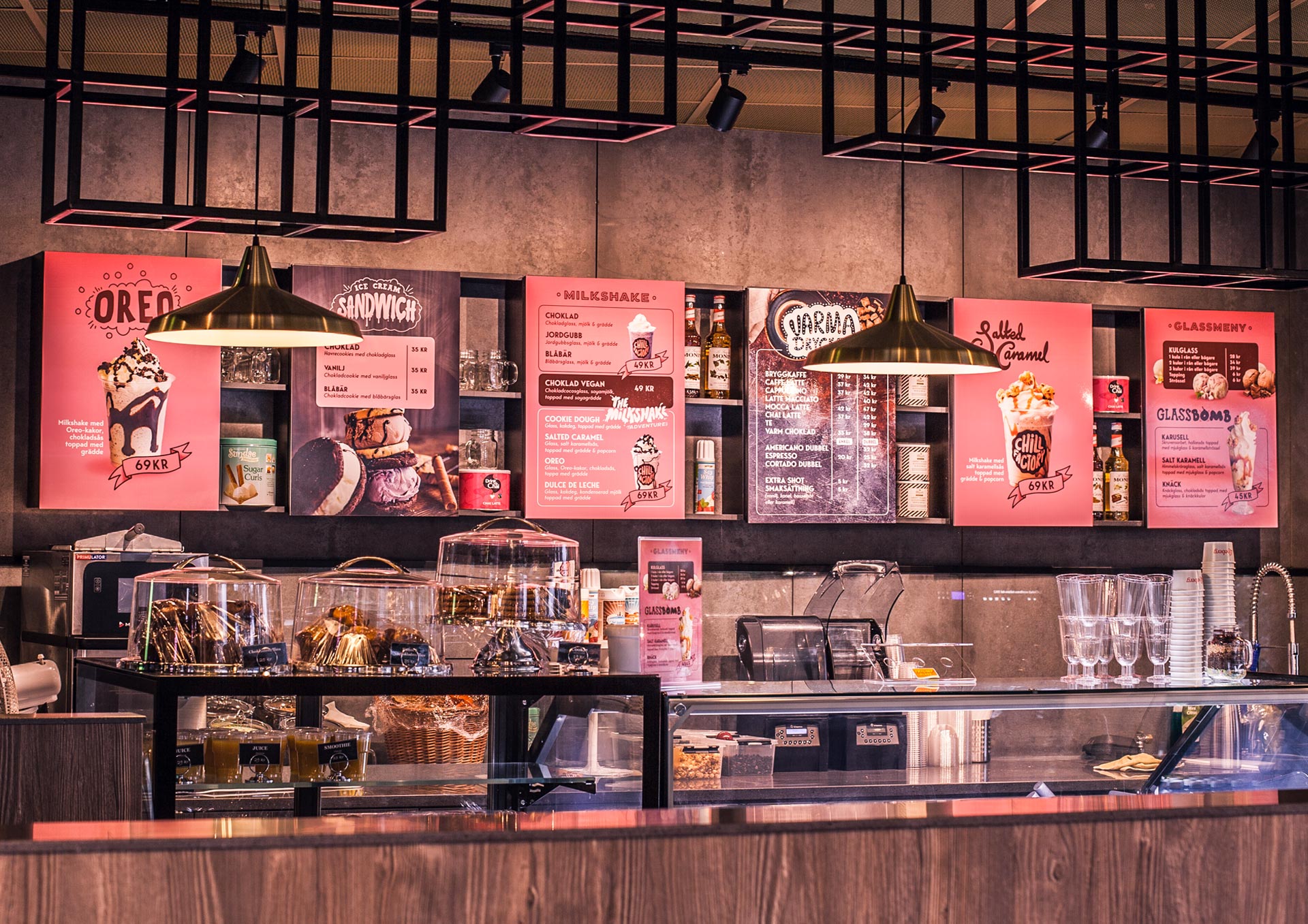
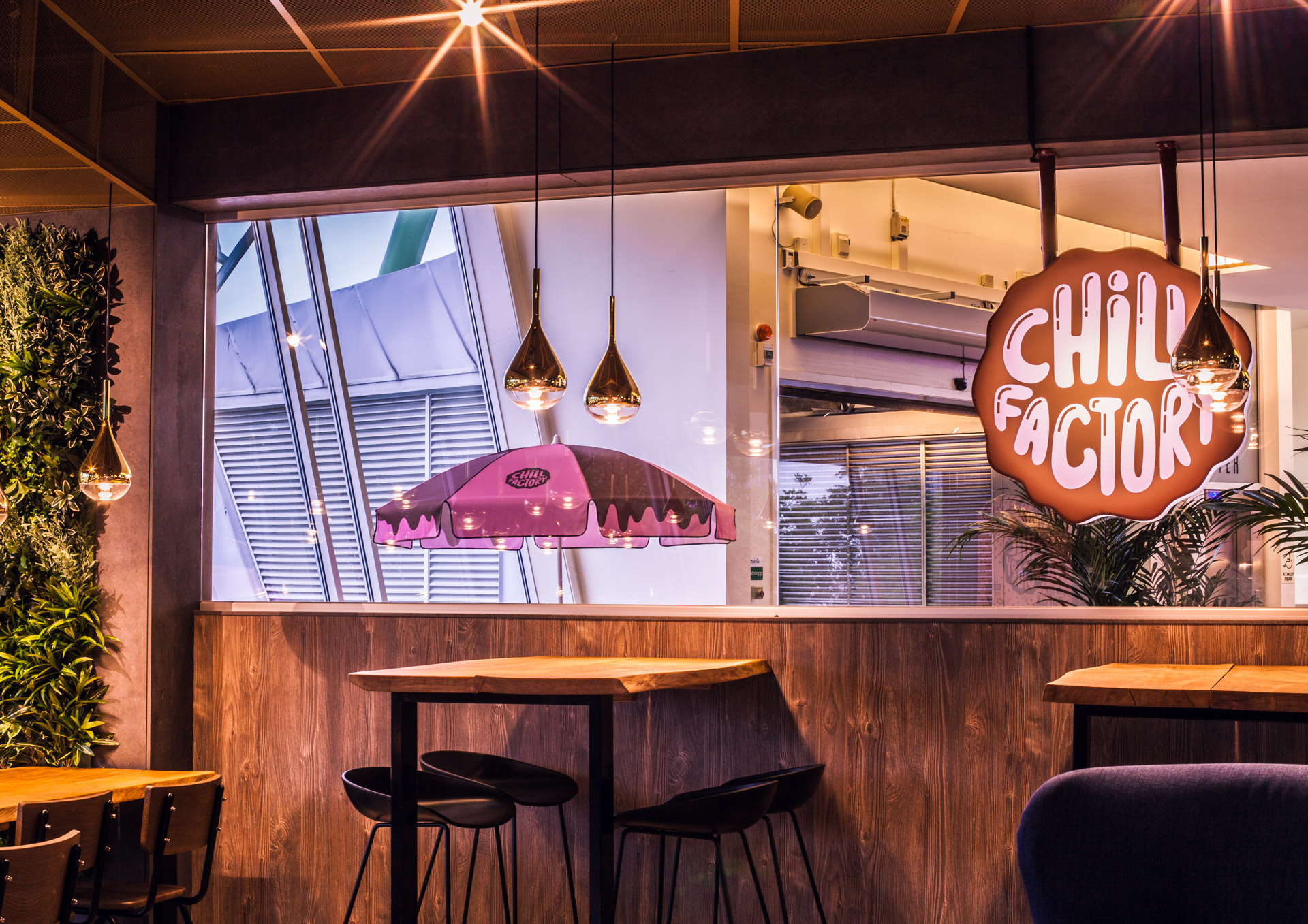
On the top of Liseberg you find some of the best milkshakes in Gothenburg. A place to chill and relax during an active day at Liseberg.
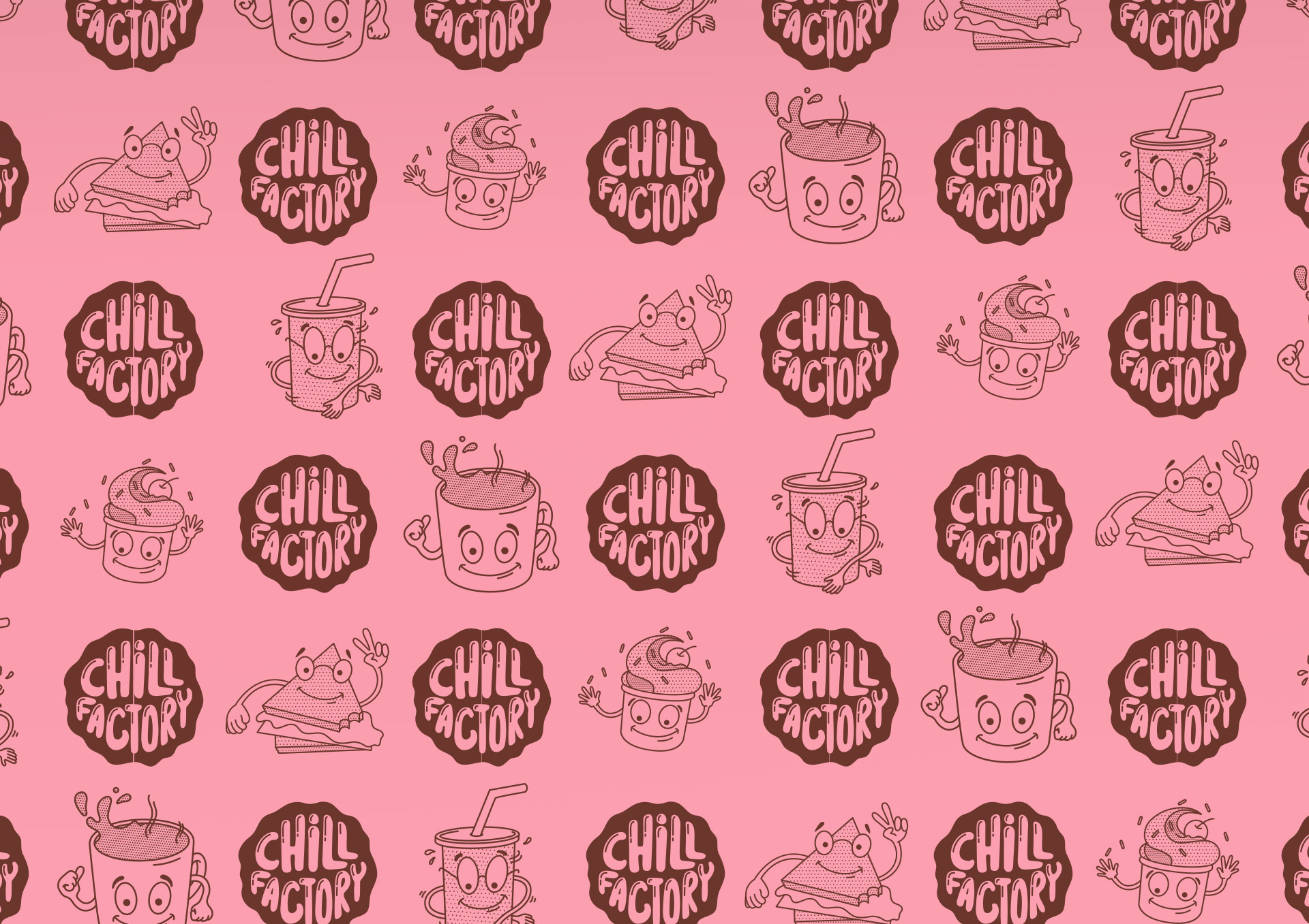
We built the brand from the joyfulness that comes from ice cream and to creat a feeling of an american diner that just meet a nordic high school tv-serie.
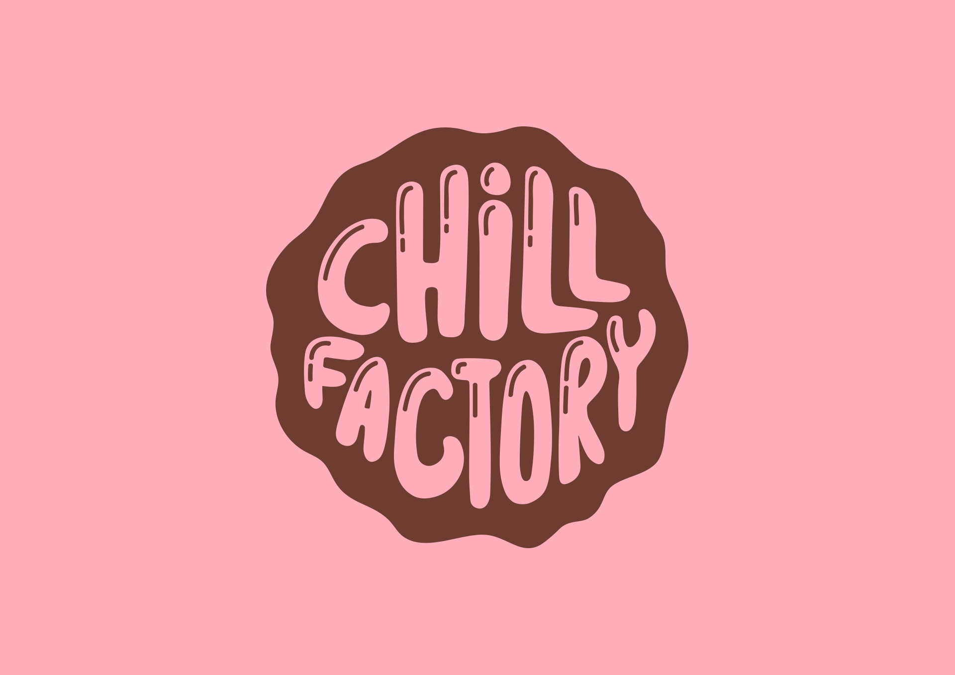
The logotype was inspired by looking at the form of a classic ice cream scoop/ball and our colors came out of the classic ice cream flavors, strawberry and chocolate. All to make a playful brand.

Case
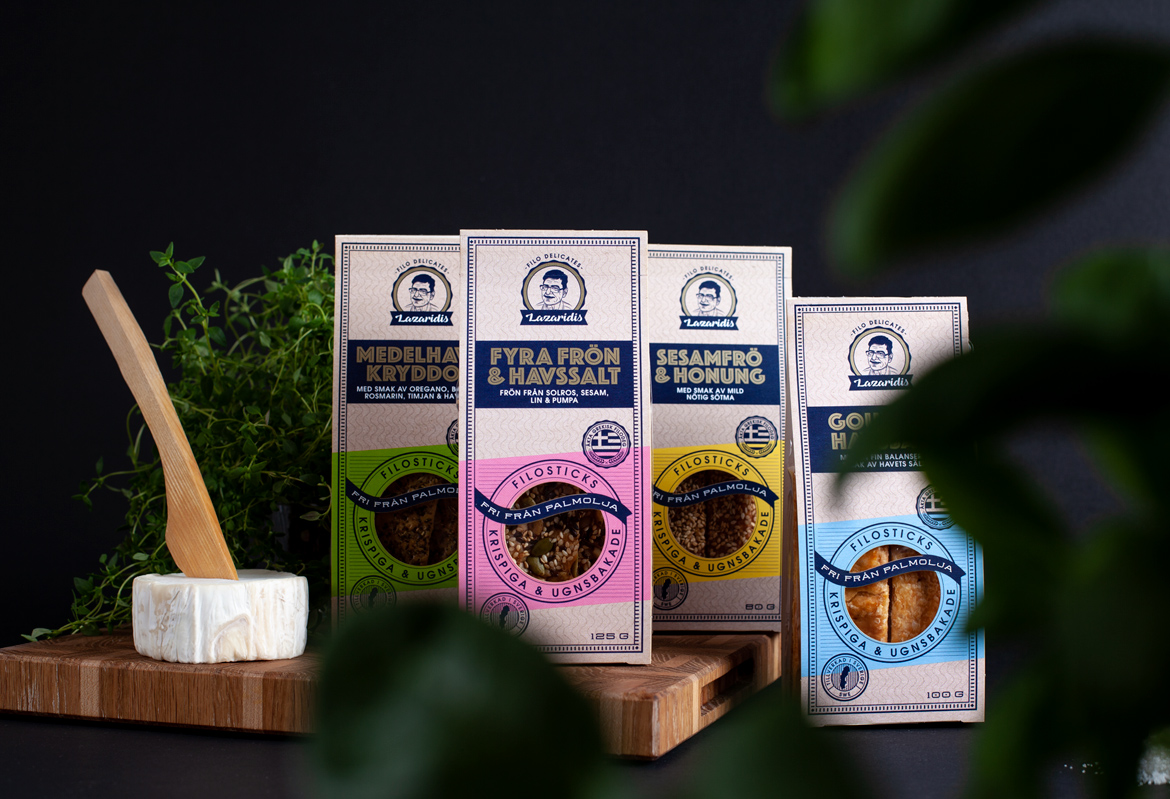
Filosticks - LazaridisPackaging
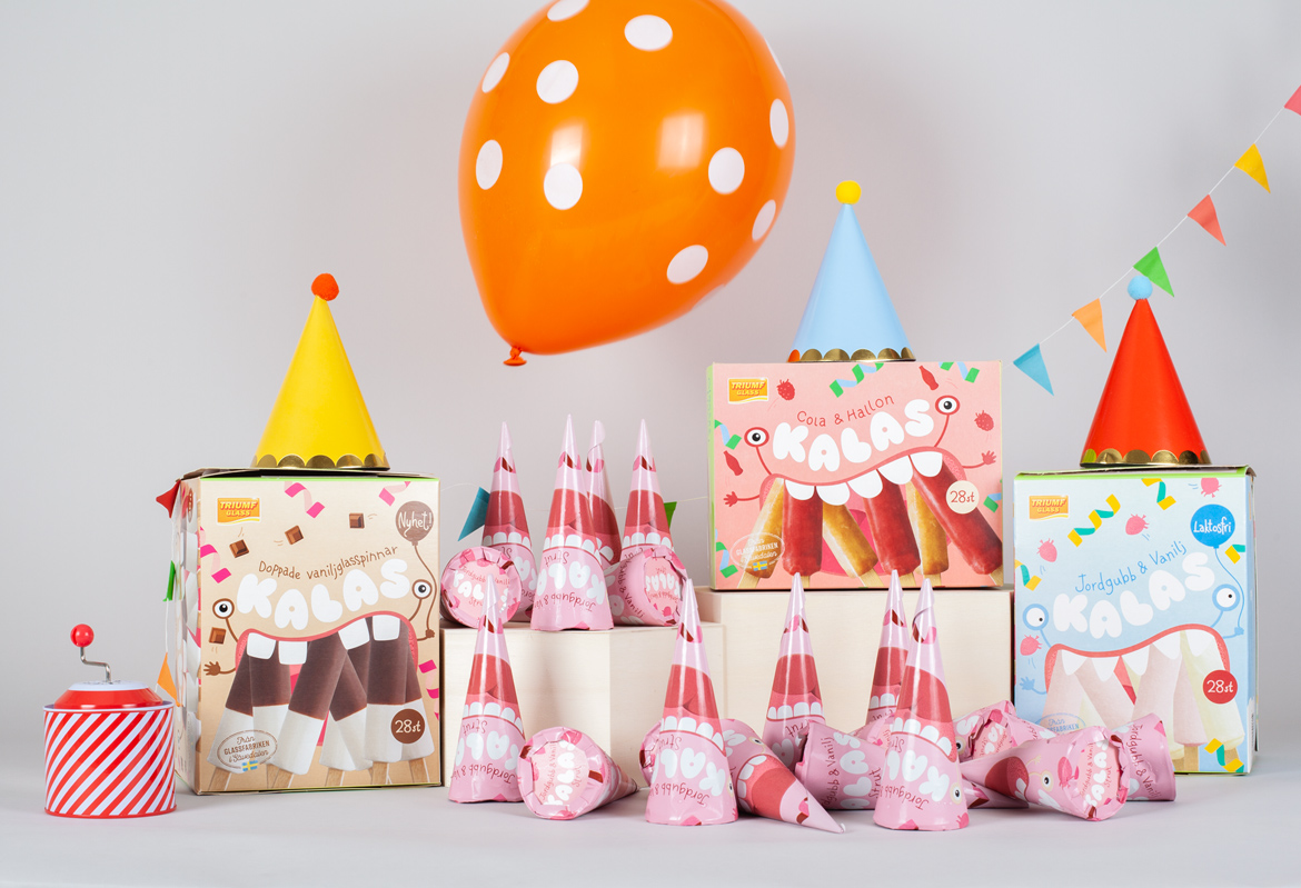
Kalas - Triumf GlassPackaging
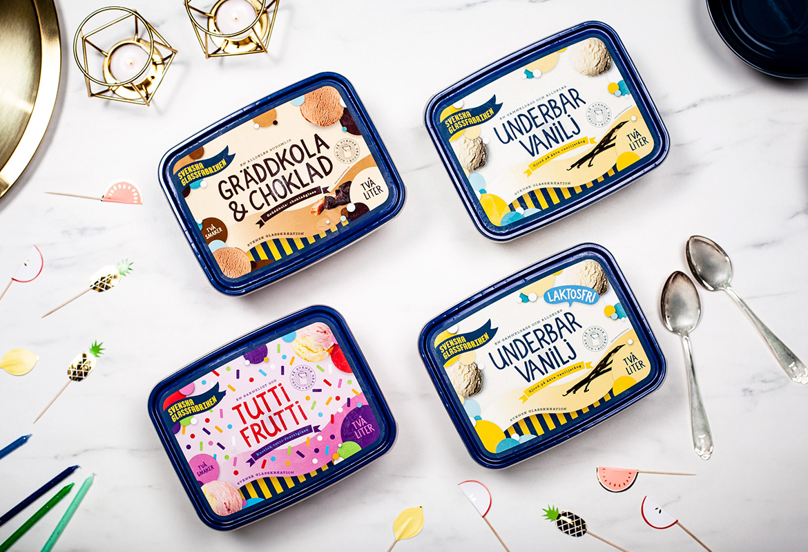
Svenska GlassfabrikenPackaging
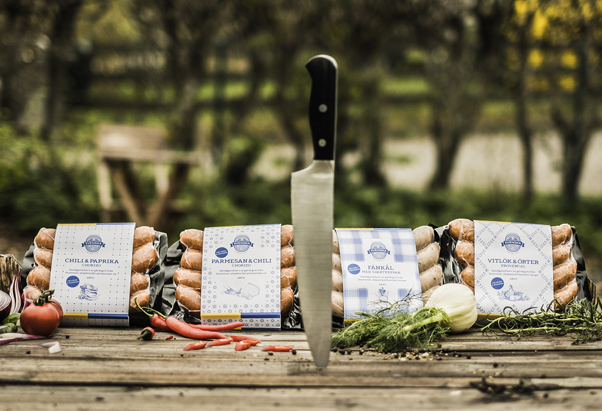
Svenska GårdarRebranding & packaging
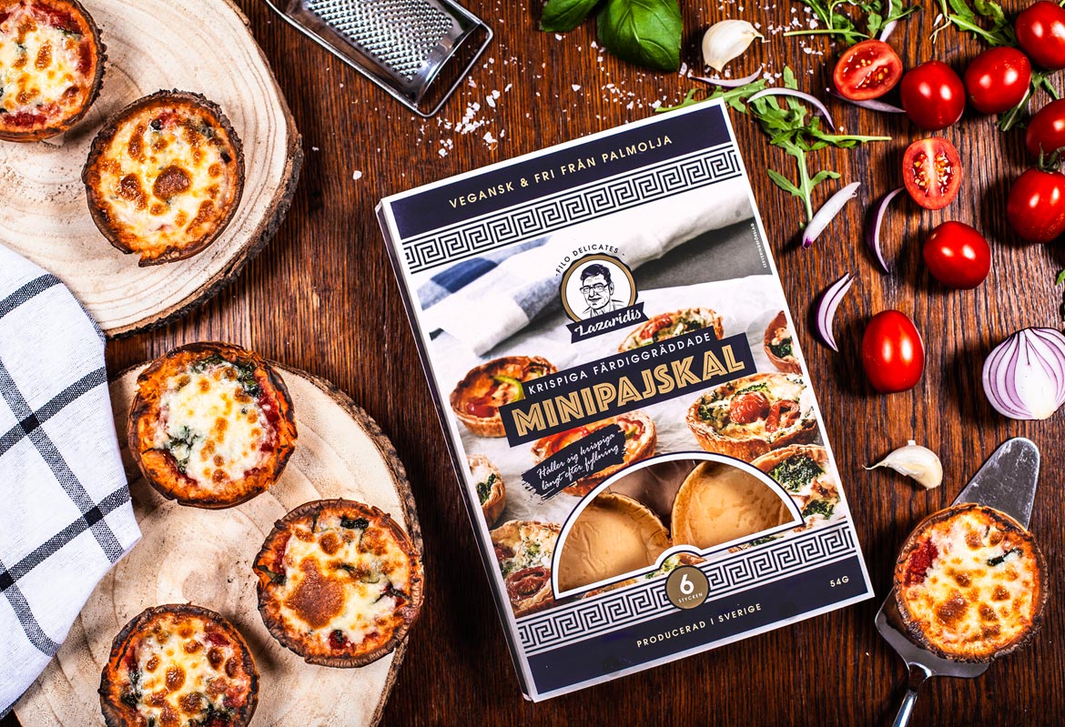
Filodelicates - LazaridisPackaging
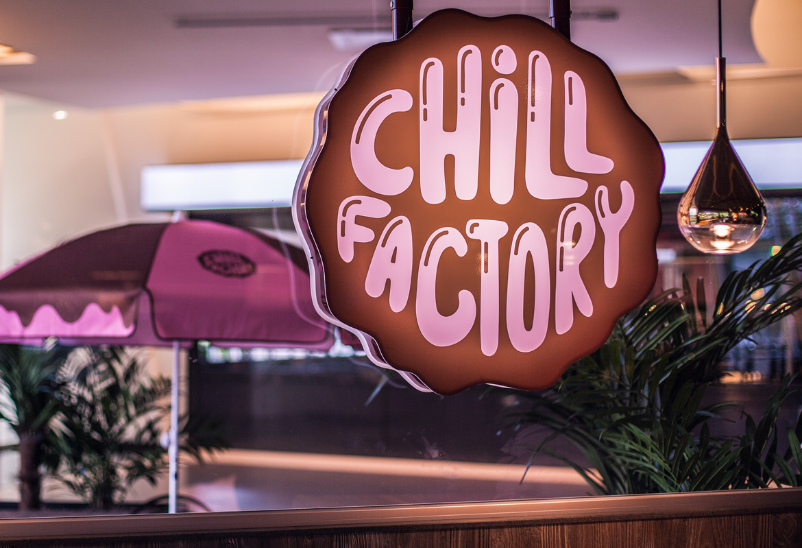
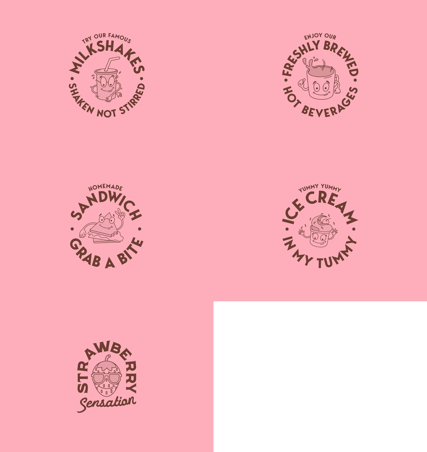
Chill FactoryBranding & illustration
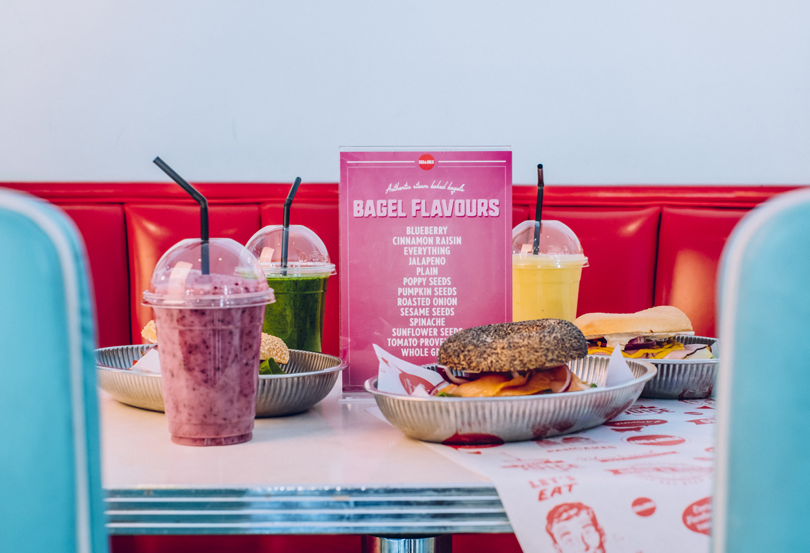
Egg & MilkBranding & illustration
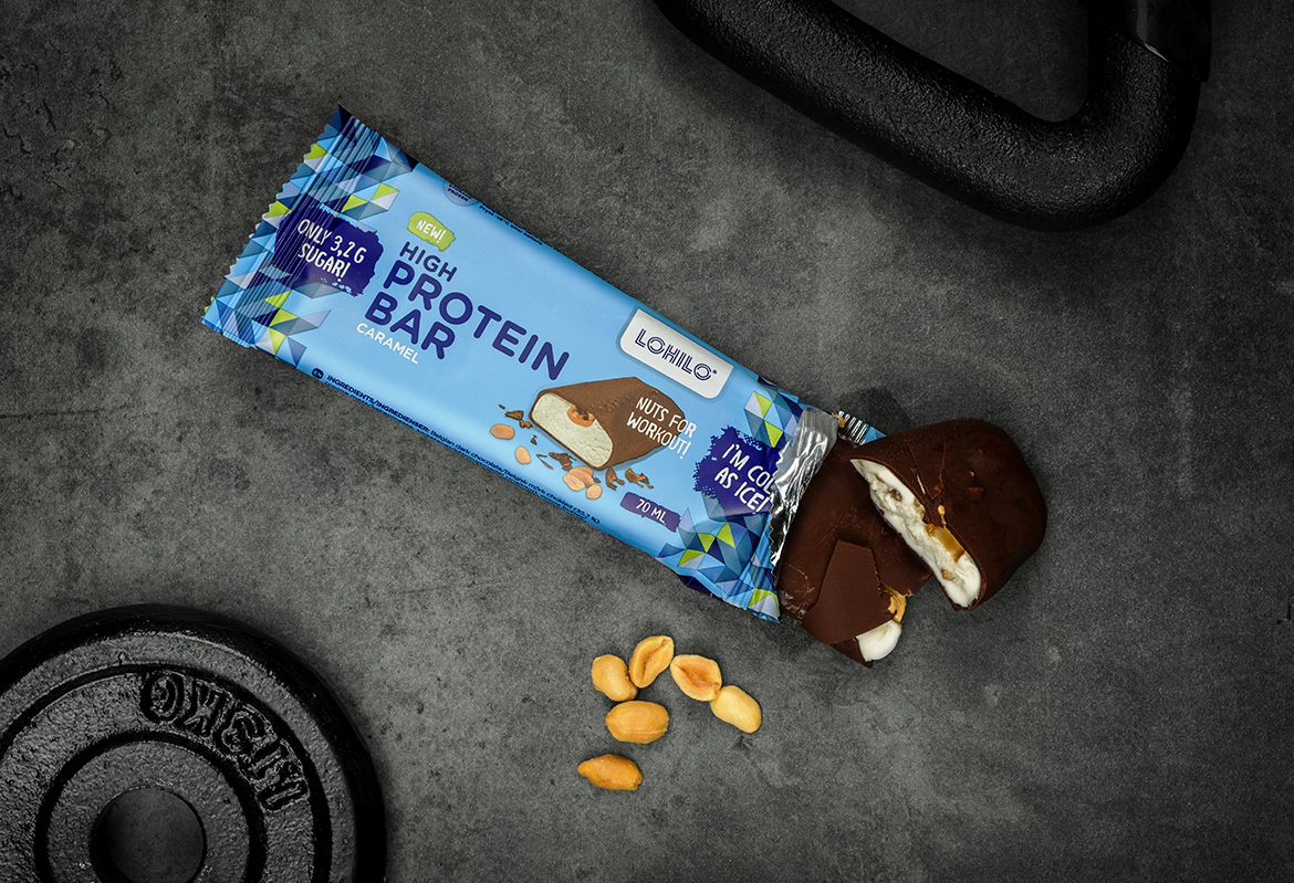
LohiloPackaging
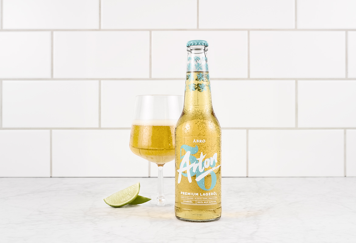
Åbro Arton 56Packaging
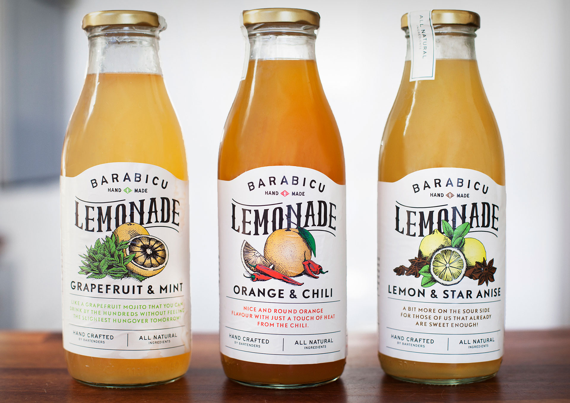
Barabicu - LemonadeIllustration & typography
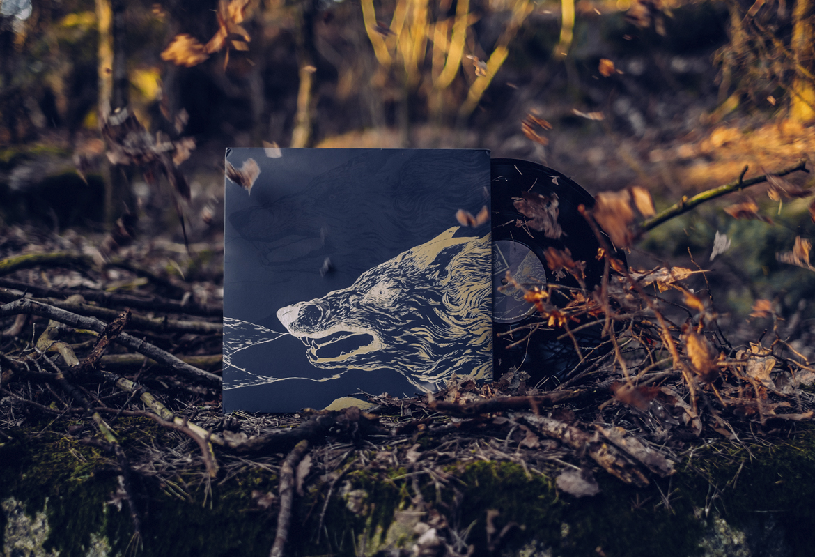
SOENAlbum cover
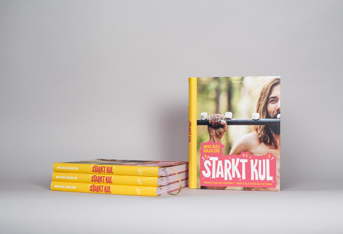
Starkt Kul - Micael DahlenBook Design

STUBOGraphic profile
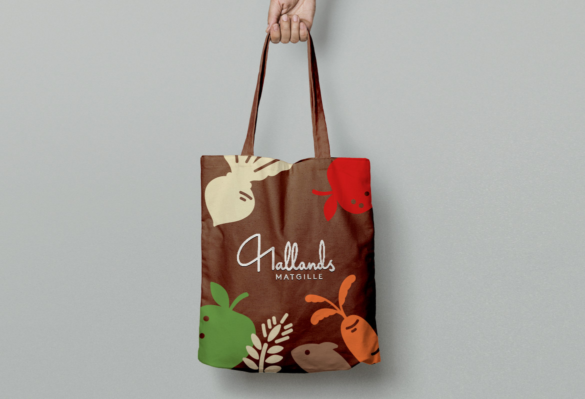
Hallands MatgilleGraphic profile
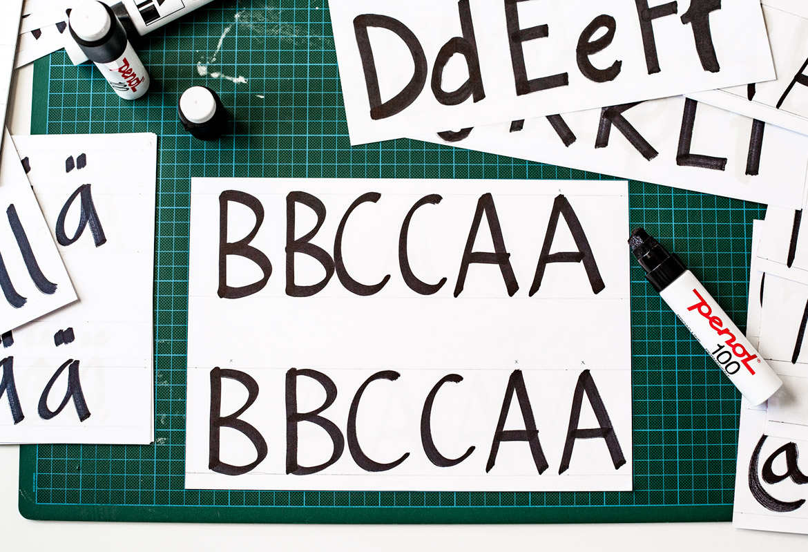
NetOnNet - TypefaceTypeface
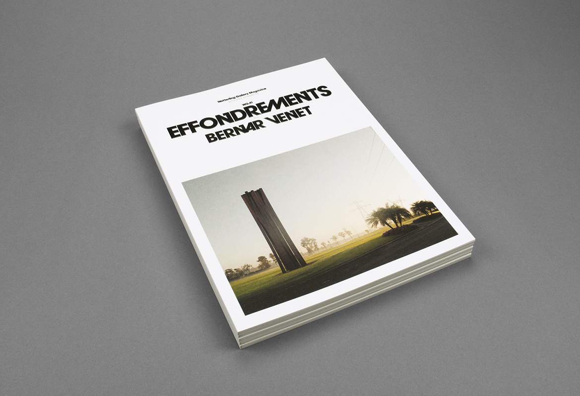
Wetterling GalleryExhibition catalogues