
Stubo - Graphic Profile
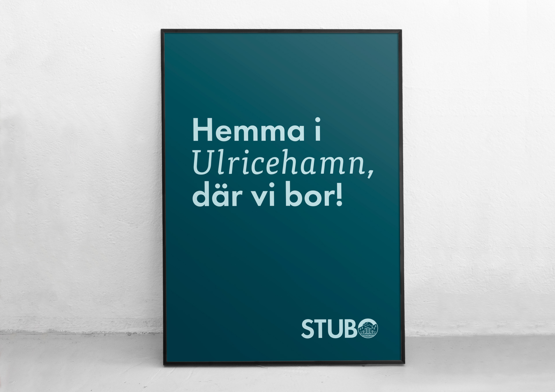
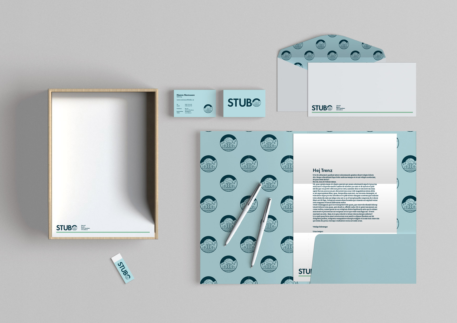
Stubo is the municipal housing company of the Swedish town Ulricehamn. The task here was to re-brand the entire comapny and make it more up to date.
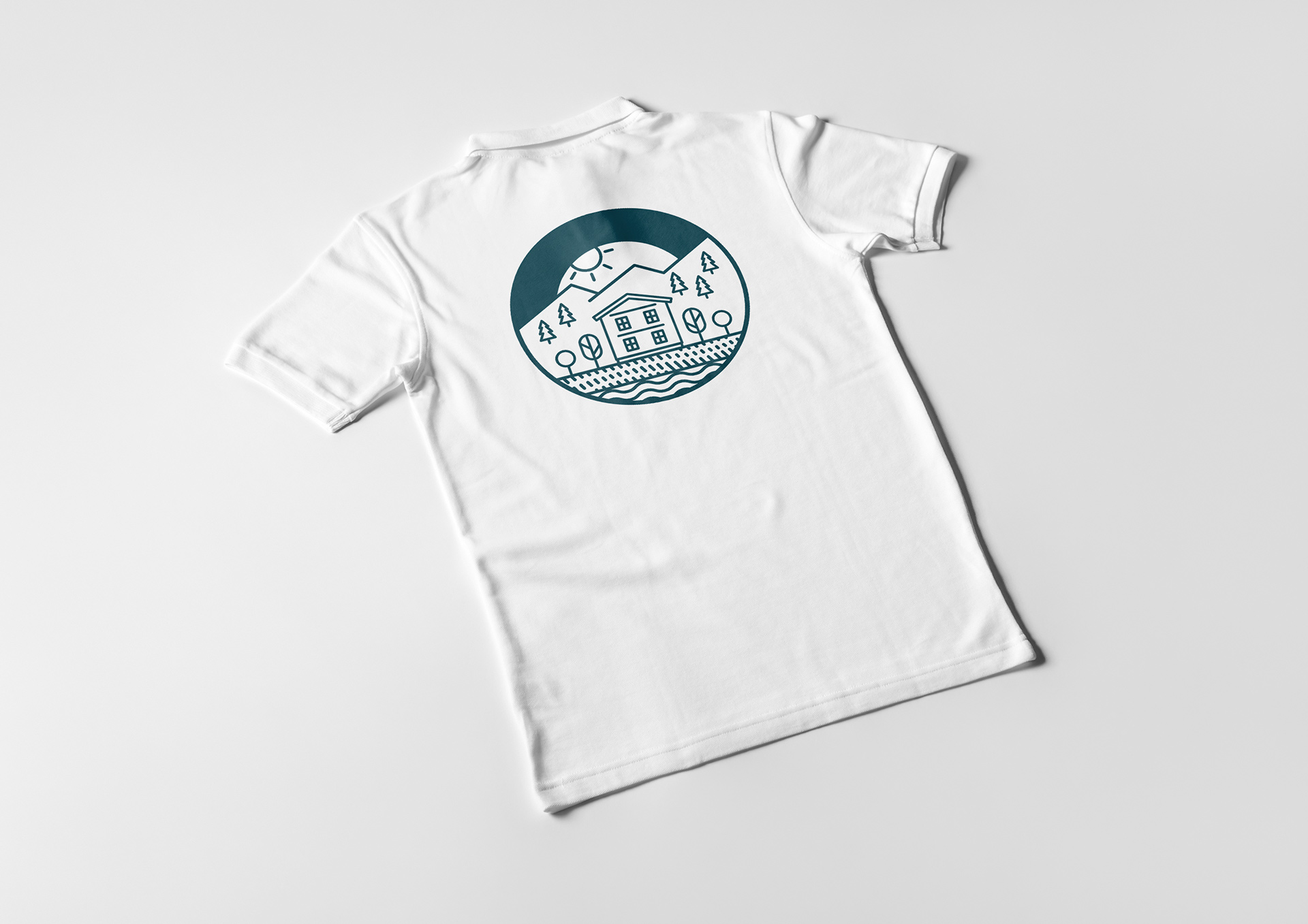
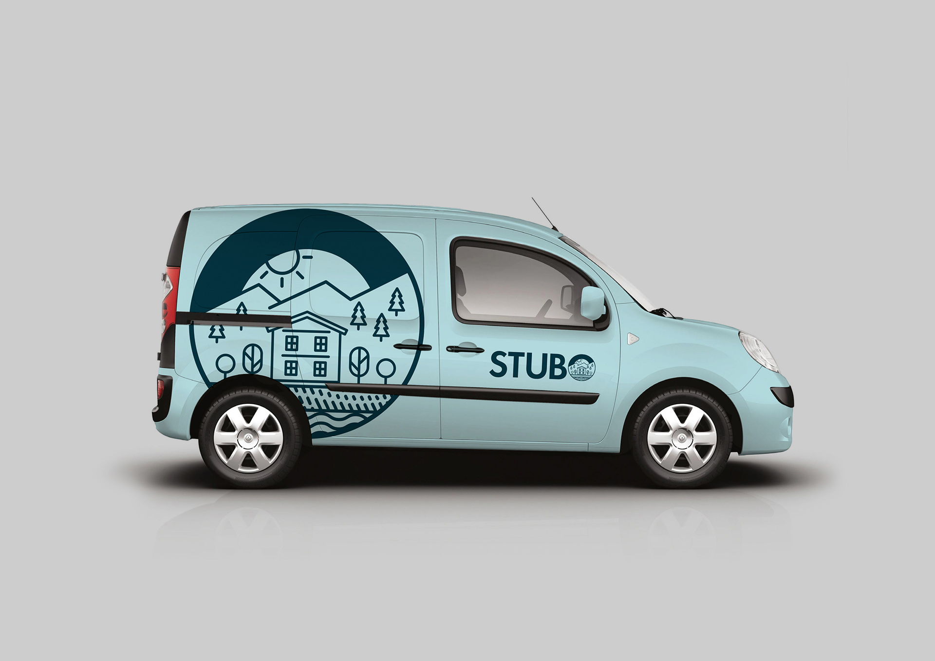
Ulricehamn is a Västra Götaland County town in Sweden. It hold about 24,000 inhabitants and Stubo is ther housing company. The town is located on the slopes of a lakeside, where the river Ätran flows into lake Åsunden. The geography is signified by the scenic nature of trees and water. So we created the logo so that the O in Stubo is a pictogram of the town scenery. The O of the logotype is alsow ment to change during the time, it's going to be the brand mark for Stubo.
Hallands Matgille
The graphic profile was created to celebrate the nature and animals that make Halland sutch a great place for food industries.
Hallands Matgille was created to promote and create a better food industry environment in Halland, Sweden. Halland is known for it's diversity of food. That's why the food became a central part of the graphic profile.
The logo was created to have a sense of craftsmanship and as a signature, a way to bring a more human feeling to the brand.

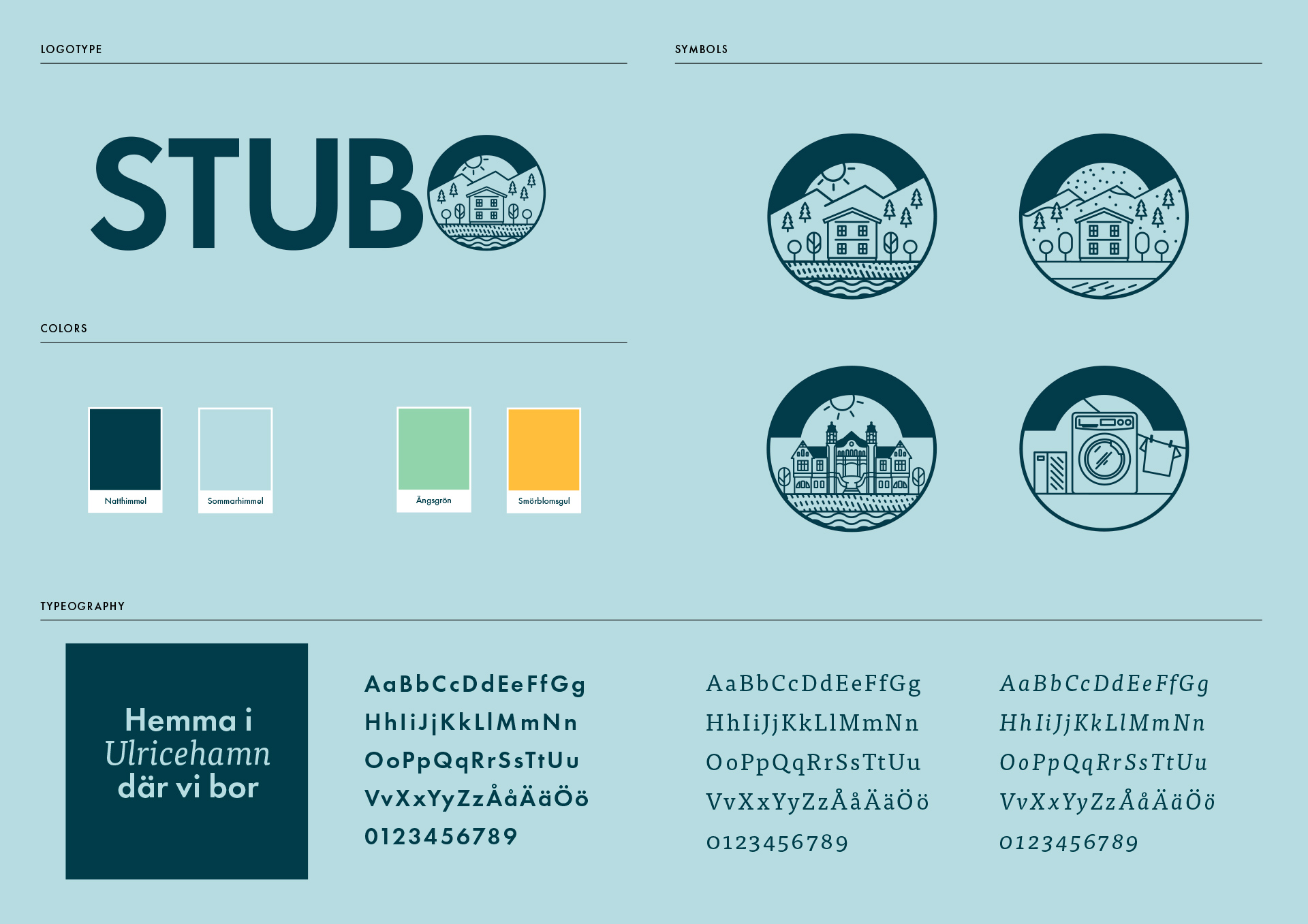
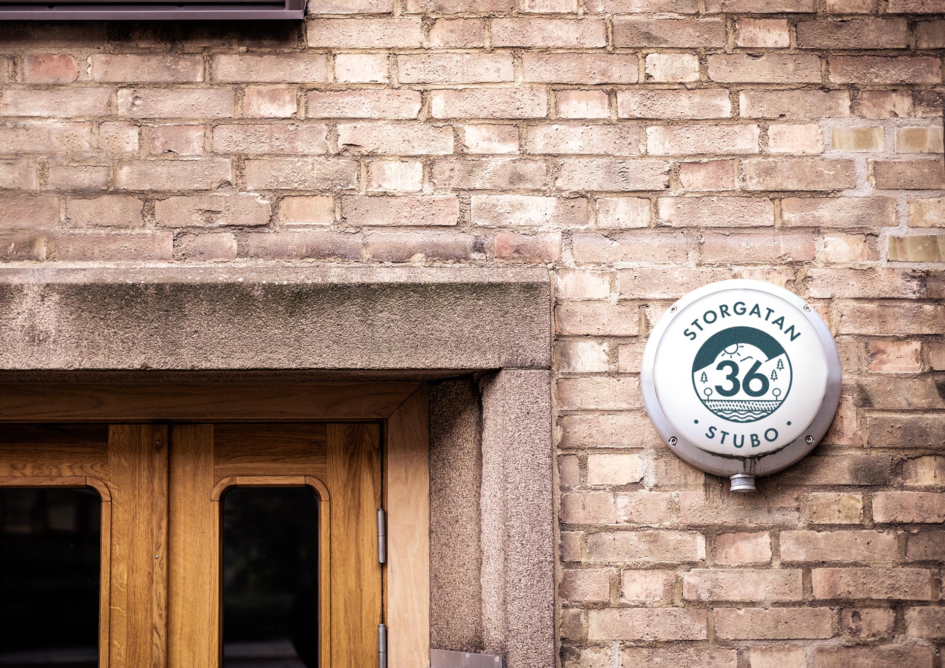
The symbol from the logotype is one of the bigest cariers in the brand of Stubo. It holds information and creats a world for the brand. Sometimes it the guide to show you witch door to enter to reach the laundry room and sometimes it's the guide to the right house number.
In the logotype it's a picture of the cinery of Ulricehamn and shows how unic the nature is around the town, one of the houses that Turbo has is also included.

Case
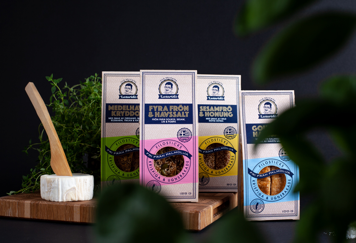
Filosticks - LazaridisPackaging
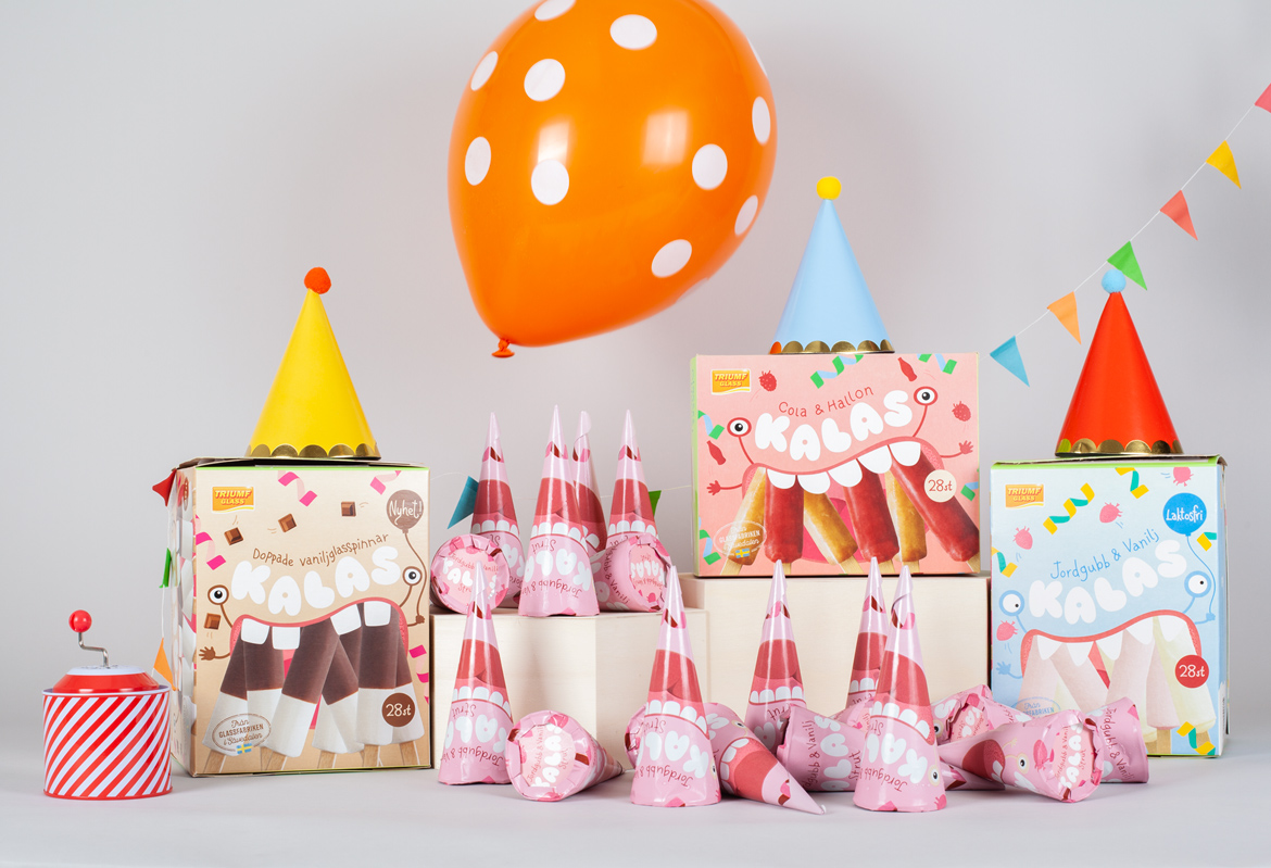
Kalas - Triumf GlassPackaging
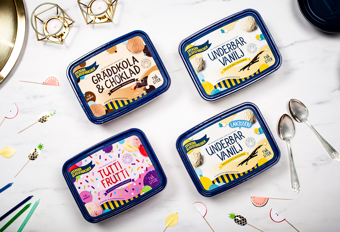
Svenska GlassfabrikenPackaging
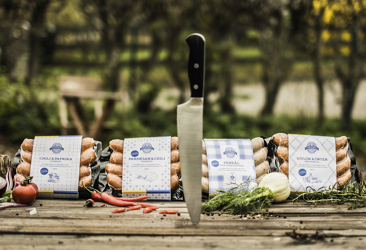
Svenska GårdarRebranding & packaging
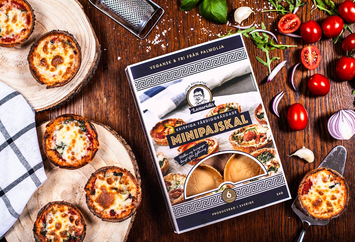
Filodelicates - LazaridisPackaging

Chill FactoryBranding & illustration
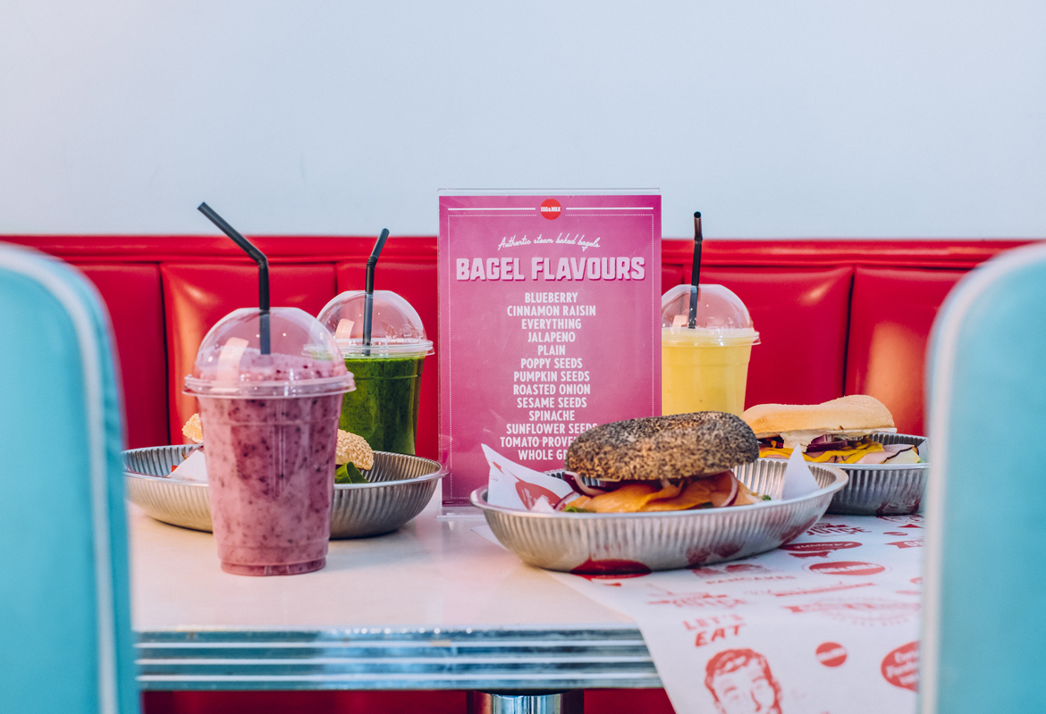
Egg & MilkBranding & illustration
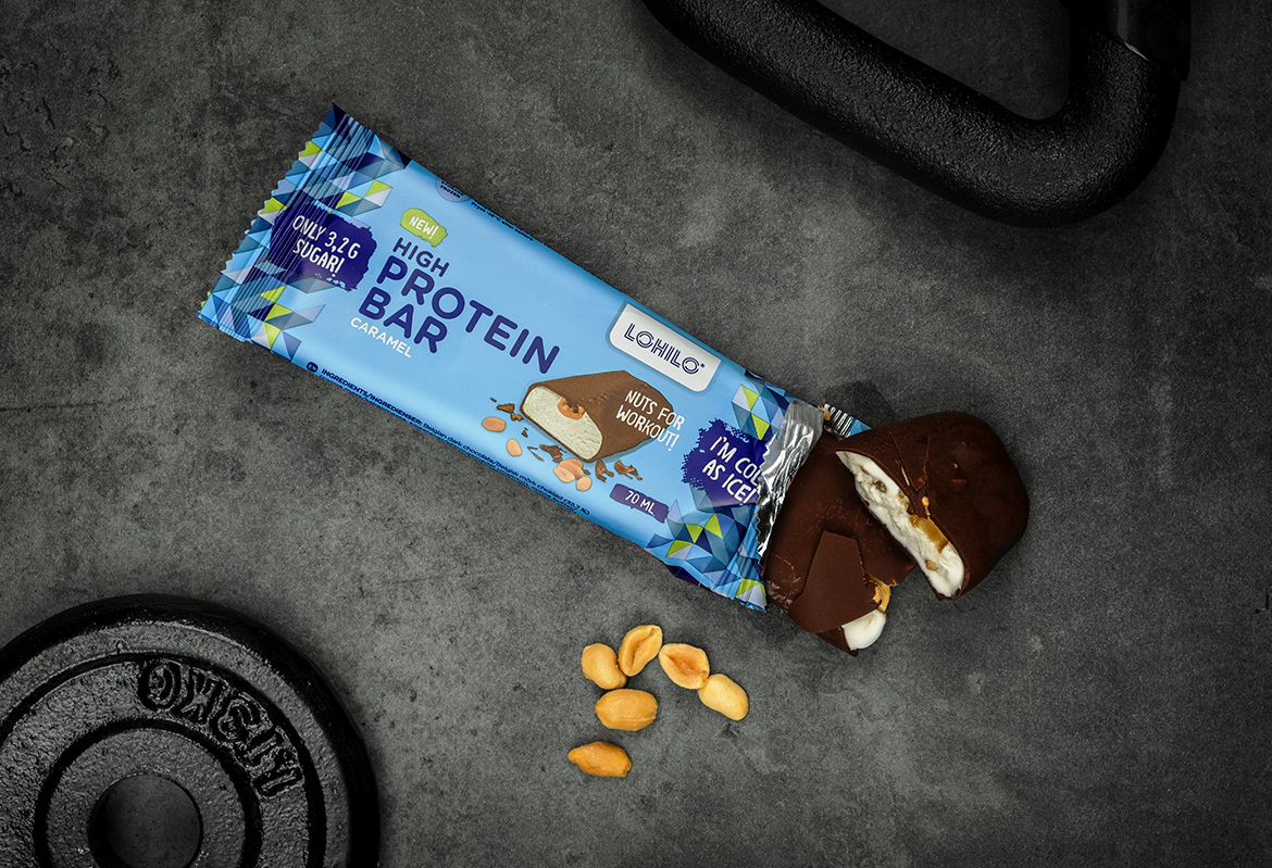
LohiloPackaging
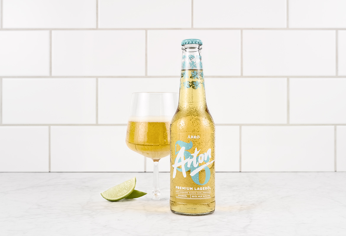
Åbro Arton 56Packaging
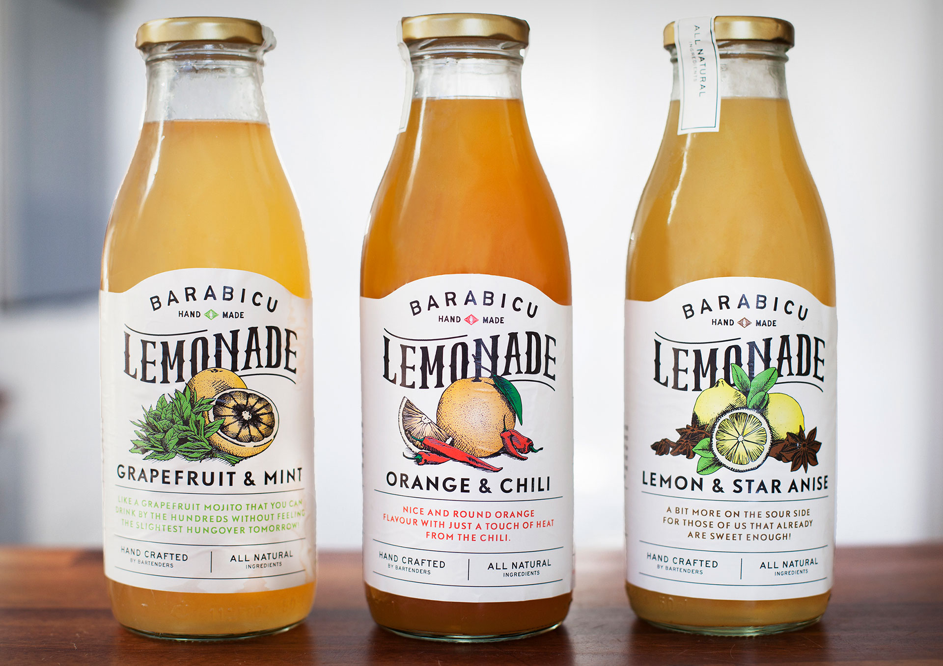
Barabicu - LemonadeIllustration & typography
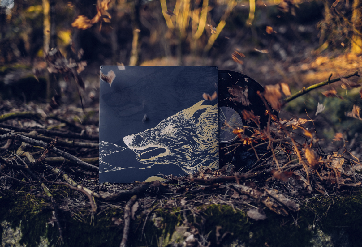
SOENAlbum cover
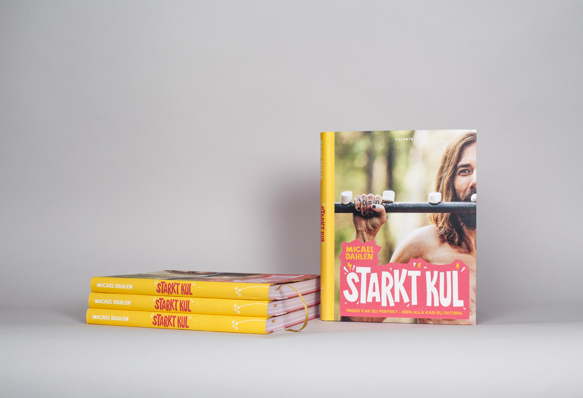
Starkt Kul - Micael DahlenBook Design

STUBOGraphic profile
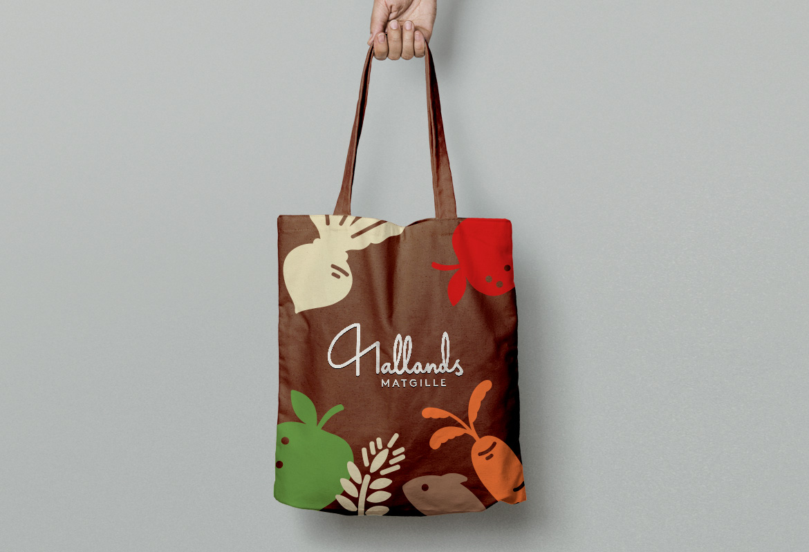
Hallands MatgilleGraphic profile
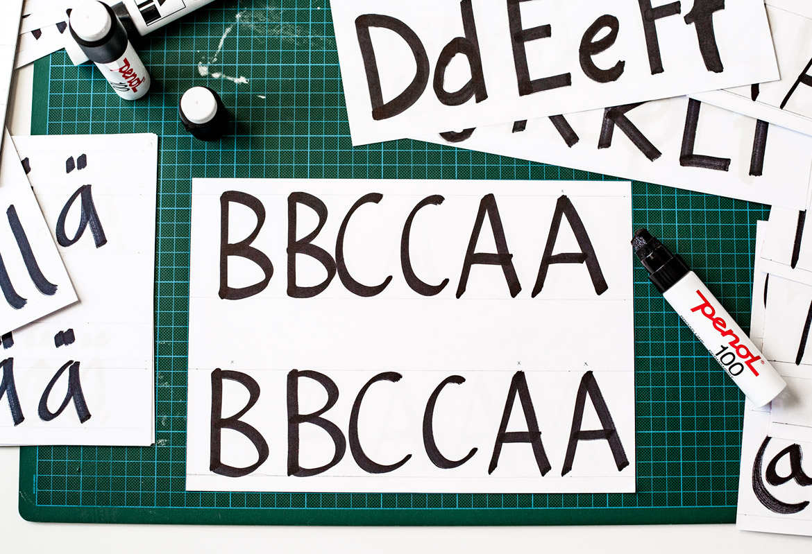
NetOnNet - TypefaceTypeface
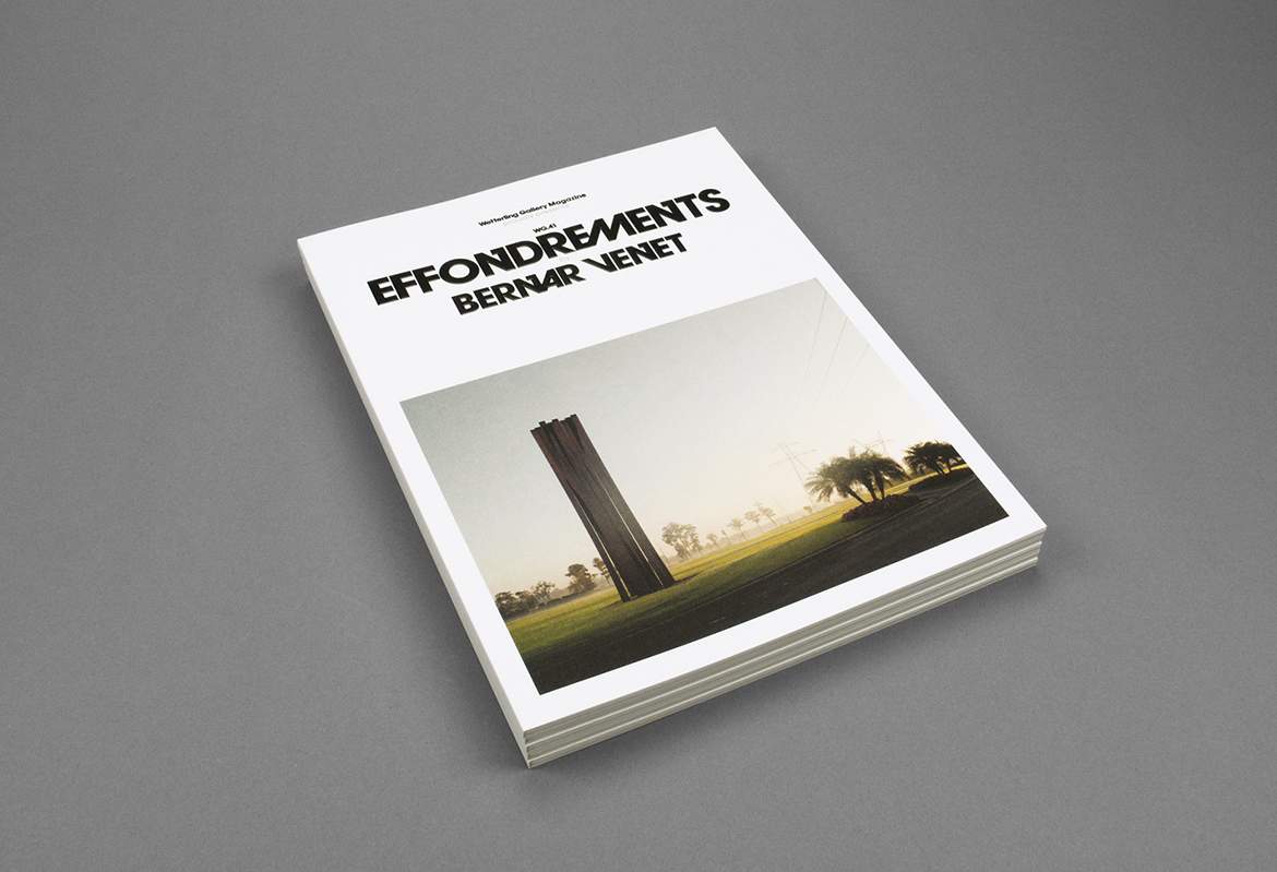
Wetterling GalleryExhibition catalogues